
Image Source - Popupsmart
Executive Overview
Email continues to be one of the highest-performing digital marketing channels for B2B SaaS companies, serving as a critical touchpoint for lead nurturing, customer engagement, and conversion. However, achieving strong results today is no longer about increasing email volume, it depends on creating user-centric email experiences that are clear, relevant, and action-oriented. Modern decision-makers expect personalized messaging, intuitive layouts, responsive designs, and frictionless calls-to-action that make it easy to book a demo, start a free trial, or explore a product further.
High-converting B2B SaaS emails combine effective UX design with strategic messaging to reduce cognitive load, improve readability, and guide recipients toward a single, measurable goal. Every design element from visual hierarchy and mobile responsiveness to CTA placement and content structure plays a role in influencing user behavior and driving engagement.
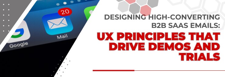
This blog explores the core UX principles behind successful B2B SaaS email design, practical strategies for improving email performance, essential tools for creating responsive campaigns, and proven best practices that help marketing teams increase click-through rates, generate more demo bookings, and maximize free trial conversions while delivering a seamless customer experience.
The Growing Importance of UX-Driven Email Design in B2B SaaS
The average B2B buyer receives dozens, sometimes hundreds of emails every day, making inbox competition more intense than ever. Simply having an attractive email template is no longer enough to capture attention or encourage action. To stand out, every email must be thoughtfully designed with the recipient's experience in mind, delivering the right message in a clear, engaging, and easy-to-navigate format.
For B2B SaaS companies, email marketing plays a critical role in moving prospects through the buyer journey from initial awareness and product consideration to scheduling a demo or activating a free trial. Every design element, including the layout, typography, messaging, visuals, and call-to-action (CTA), influences how recipients interact with the email and whether they choose to take the next step.
A user experience (UX)-focused email design minimizes cognitive effort by presenting information in a logical, visually appealing manner. Instead of overwhelming readers with lengthy content or multiple competing actions, effective SaaS emails prioritize clarity, relevance, and simplicity. A well-structured email enables busy decision-makers to quickly understand the value proposition and act with confidence.
As B2B buying journeys become increasingly digital and self-directed, organizations that invest in user-centric email design gain a competitive advantage. When thoughtful UX principles are combined with compelling content and strategic personalization, email evolves from a communication channel into a powerful conversion tool that consistently drives qualified demos, free trial sign-ups, and long-term customer relationships.
Why User Experience Is the Foundation of High-Converting B2B SaaS Emails
Many marketers associate User Experience (UX) with websites, mobile applications, or software interfaces. However, the same UX principles play an equally critical role in email marketing particularly for B2B SaaS companies, where emails often serve as the first meaningful interaction between a business and a potential customer.
A well-designed email should do more than look visually appealing. It should guide readers effortlessly through the content, communicate value quickly, and encourage them to take a specific action, such as booking a product demo or starting a free trial. Since B2B decision-makers have limited time and receive numerous marketing emails every day, they are more likely to engage with emails that are simple, relevant, and easy to navigate.
Effective email UX immediately answers the questions every recipient subconsciously asks:
What is this email about?
Why is this relevant to my business?
What value does it offer me?
What action should I take next?
How easy is it to complete that action?
If recipients cannot find these answers within the first few seconds, they are likely to ignore the message or move on to the next email in their inbox.
Research consistently shows that most professionals scan emails rather than read them line by line. This makes visual hierarchy, concise messaging, and intuitive design essential components of a successful email strategy. Instead of overwhelming readers with lengthy paragraphs or multiple competing calls-to-action, high-performing B2B SaaS emails use clean layouts, strategic whitespace, compelling headlines, and a single, well-defined objective to guide user behavior.
By prioritizing user experience, SaaS companies can create email campaigns that not only capture attention but also build trust and improve conversion rates throughout the buyer's journey.
The primary objectives of UX-focused email design include:
Faster information discovery
Reduced cognitive load and decision fatigue
Higher click-through rates (CTR)
Increased free trial activations
More qualified demo bookings
Stronger customer trust and credibility
Improved engagement across multiple devices
A smoother and more intuitive user journey from inbox to landing page
By treating email as an extension of the overall product experience rather than just another marketing channel, B2B SaaS organizations can significantly improve lead generation, customer engagement, and long-term conversion performance.
The Relationship Between Email Design and Conversion
A visually appealing email may capture attention, but design alone is not enough to drive conversions. In B2B SaaS marketing, the ultimate goal is to encourage prospects to take a specific action whether that is booking a product demo, starting a free trial, or requesting a consultation. If the email lacks clarity or presents too many choices, recipients are more likely to leave without engaging.
High-performing emails strike the right balance between aesthetics and usability. Every design element including the headline, supporting copy, visuals, white space, and call-to-action (CTA) should work together to guide readers naturally toward the intended action. A clean, well-structured layout makes it easier for busy decision-makers to quickly understand the value being offered and respond confidently.
One of the most common mistakes in B2B email marketing is including multiple competing CTAs in a single email. While it may seem helpful to offer several options, doing so often creates decision fatigue and reduces the likelihood that users will click any of them.
For example, an email that includes several links such as:
Learn More
Visit Blog
Watch Webinar
Read Case Study
Contact Sales
can overwhelm recipients by asking them to choose from too many actions.
A more effective approach is to center the email around one clear objective, such as:
Book Your Personalized Demo
With a single, prominent CTA, readers immediately understand what the next step is, making it easier for them to act. Supporting content should reinforce the value of taking that action rather than introducing additional distractions.
Ultimately, the fewer obstacles users face during their decision-making process, the higher the chances of conversion. By simplifying the user journey and keeping the message focused, B2B SaaS companies can improve click-through rates, generate more qualified demo bookings, and increase free trial sign-ups.
The Relationship Between Email Design and Conversion
A visually appealing email may capture attention, but design alone is not enough to drive conversions. In B2B SaaS marketing, the ultimate goal is to encourage prospects to take a specific action whether that is booking a product demo, starting a free trial, or requesting a consultation. If the email lacks clarity or presents too many choices, recipients are more likely to leave without engaging.
High-performing emails strike the right balance between aesthetics and usability. Every design element including the headline, supporting copy, visuals, white space, and call-to-action (CTA) should work together to guide readers naturally toward the intended action. A clean, well-structured layout makes it easier for busy decision-makers to quickly understand the value being offered and respond confidently.
One of the most common mistakes in B2B email marketing is including multiple competing CTAs in a single email. While it may seem helpful to offer several options, doing so often creates decision fatigue and reduces the likelihood that users will click any of them.
For example, an email that includes several links such as:
Learn More
Visit Blog
Watch Webinar
Read Case Study
Contact Sales
can overwhelm recipients by asking them to choose from too many actions.
A more effective approach is to center the email around one clear objective, such as:
Book Your Personalized Demo
With a single, prominent CTA, readers immediately understand what the next step is, making it easier for them to act. Supporting content should reinforce the value of taking that action rather than introducing additional distractions.
Ultimately, the fewer obstacles users face during their decision-making process, the higher the chances of conversion. By simplifying the user journey and keeping the message focused, B2B SaaS companies can improve click-through rates, generate more qualified demo bookings, and increase free trial sign-ups.
Solutions, Tools, and Strategies
1. Create a Clear Visual Hierarchy


Image Source - Popupsmart
A clear visual hierarchy helps readers quickly understand the purpose of your email without having to search for important information. Since most B2B professionals scan emails rather than read every word, your design should naturally guide their attention from the headline to the value proposition and finally to the call-to-action (CTA). A well-structured layout improves readability, reduces cognitive load, and encourages users to take the desired action.
Users should be able to immediately identify:
Headline – A compelling headline that clearly communicates the primary benefit or value of the email.
Supporting Benefit – A concise subheading or short paragraph that explains how your solution addresses a business challenge or helps achieve a specific goal.
CTA Button – A visually prominent button that directs readers toward a single action, such as Book a Demo, Start Free Trial, or Schedule a Consultation.
To establish an effective visual hierarchy, use:
Large, bold headlines to capture attention immediately.
Short paragraphs that are easy to scan and digest.
Plenty of white space to prevent the email from appearing cluttered and to improve readability.
Consistent typography with clear font sizes, weights, and spacing to create a professional and cohesive look.
Logical content flow, arranging information in the order users naturally consume it—from the headline and supporting message to the CTA.
High-contrast CTA buttons that stand out from the rest of the design and encourage clicks.
A strong visual hierarchy naturally guides readers through the email without overwhelming them. By presenting information in a clear and organized manner, B2B SaaS companies can improve engagement, increase click-through rates, and drive more demo bookings and free trial sign-ups.
2. Design for Mobile First

Image Source - Popupsmart
Today, a significant percentage of B2B decision-makers check their emails on smartphones before switching to a desktop. If an email is difficult to read, requires excessive zooming, or has buttons that are hard to tap, recipients are more likely to abandon it without taking action. A mobile-first approach ensures your email delivers a smooth and engaging experience regardless of the device being used.
To optimize your B2B SaaS emails for mobile, follow these best practices:
Use single-column layouts to create a clean, easy-to-follow reading experience.
Design large, touch-friendly CTA buttons that users can easily tap with their fingers.
Choose readable font sizes (16px or larger) to eliminate the need for zooming.
Implement responsive email templates that automatically adjust to different screen sizes and orientations.
Keep subject lines concise (around 35–50 characters) so they display properly on mobile inboxes.
Optimize images by compressing file sizes for faster loading while maintaining visual quality.
Add sufficient white space between sections to improve readability and reduce visual clutter.
Avoid small links placed too close together, as they can be difficult to tap accurately on touchscreens.
A responsive, mobile-first email design not only improves the user experience but also increases click-through rates, demo bookings, and free trial sign-ups by making it effortless for recipients to engage with your content wherever they are.
3. Focus Every Email on One Goal

Image Source - Popupsmart
One of the most effective UX principles in B2B SaaS email design is maintaining a single, clear objective for every email. When readers are presented with too many choices, they may become overwhelmed and leave without taking any action. A focused email eliminates distractions and guides prospects toward one meaningful conversion step.
Before designing an email, identify the primary goal you want the recipient to achieve. Every element from the subject line and headline to the body copy and call-to-action (CTA) should reinforce that single objective.
Common goals for B2B SaaS emails include:
Schedule a product demo
Start a free trial
Upgrade an existing subscription
Watch a product walkthrough or feature demo
Download an industry guide, whitepaper, or case study
For example, if the objective is to encourage demo bookings, avoid including multiple secondary links such as blogs, webinars, pricing pages, or resource centers. Instead, highlight the product's value, address a key business challenge, and make the "Book a Demo" button the most prominent element in the email.
A focused email creates a smoother user experience, reduces decision fatigue, and makes it easier for prospects to take the desired action. This often results in higher click-through rates, more qualified demo requests, and better trial activation rates. By limiting competing CTAs and keeping the messaging aligned with a single goal, B2B SaaS companies can significantly improve email performance and overall campaign effectiveness.
4. Write Benefit-Oriented Headlines

Image Source - Popupsmart
Your email headline is often the first element recipients notice after opening the message. In just a few seconds, it should communicate why the email matters and what value the reader will gain. Instead of focusing solely on product features, emphasize the business outcomes your solution delivers. Decision-makers are more interested in solving problems, increasing efficiency, or driving revenue than learning about technical capabilities.
Benefit-oriented headlines immediately answer the question, "What's in it for me?" This approach creates relevance, captures attention, and encourages readers to continue engaging with the email.
Weak headline:
Explore Our CRM Dashboard
This headline tells readers what the product has but doesn't explain why they should care.
Better headline:
Close More Deals with Automated Pipeline Management
This version highlights the value users can expect—improving sales performance through automation—making it more compelling for busy decision-makers.
Additional examples include:
When writing headlines, keep these best practices in mind:
Lead with the customer's desired outcome rather than the product feature.
Use clear, concise language that is easy to understand.
Highlight measurable benefits such as saving time, reducing costs, increasing productivity, or improving revenue.
Avoid technical jargon unless your audience is highly specialized.
Ensure the headline aligns with the email's primary call-to-action.
A strong benefit-oriented headline sets the tone for the entire email, reinforces your value proposition, and motivates prospects to take the next step whether that's booking a demo, starting a free trial, or learning more about your solution.
5. Make CTA Buttons Impossible to Miss

Image Source - Tabular Email Builder
The call-to-action (CTA) button is one of the most important elements in any B2B SaaS email. No matter how compelling your copy or visually appealing your design is, the email will not convert if recipients are unsure about the next step. A well-designed CTA should immediately stand out and clearly communicate the value of clicking it.
To maximize conversions, ensure your CTA button includes:
High contrast that differentiates it from the rest of the email while remaining consistent with your brand colors.
A large, clickable area that is easy to tap on both desktop and mobile devices.
Action-oriented language that tells users exactly what they will gain by clicking.
Strategic placement, ideally above the fold and repeated near the end of longer emails if appropriate.
Sufficient white space around the button so it naturally draws attention without competing with other design elements.
Effective CTA copy focuses on the user's desired outcome rather than a generic action. Instead of simply asking readers to click, communicate the value they will receive.
Examples of high-converting CTA buttons:
Start Free Trial
Book My Demo
See It in Action
Get Started Today
Schedule a Live Demo
Explore the Platform
Request a Personalized Demo
Avoid vague or passive CTA text that doesn't provide a compelling reason to take action, such as:
Click Here
Learn More
Submit
Read More
A useful best practice is to include only one primary CTA in each email. Presenting multiple competing actions can create decision fatigue and reduce click-through rates. By keeping the CTA clear, visually prominent, and aligned with the email's objective, you create a smoother user experience that encourages more demo bookings and free trial sign-ups.
6. Keep Email Copy Scannable

Image Source - Campaign Monitor
B2B decision-makers often skim emails rather than reading every sentence, especially when managing busy schedules. If your email appears cluttered or text-heavy, recipients may lose interest before reaching your call-to-action. A scannable email design helps readers quickly identify the key message, understand the value being offered, and take the desired action without unnecessary effort.
To improve readability and engagement, structure your email using:
Bullet points to summarize key benefits or features.
Short sections with clear subheadings to break up content.
Bold highlights to emphasize important information, statistics, or value propositions.
Simple, conversational language that avoids technical jargon and communicates benefits clearly.
Clear spacing and white space to reduce visual clutter and make the email easier to navigate.
Instead of overwhelming readers with long explanations, focus on communicating the most important points first. Place your primary value proposition near the top of the email, followed by concise supporting information and a prominent call-to-action.
A well-structured, easy-to-scan email not only improves the user experience but also increases the likelihood that recipients will engage with your content, click your CTA, and move closer to booking a demo or starting a free trial.
7. Personalize Beyond First Names

Image Source - WowMakers
Modern B2B SaaS buyers expect emails that reflect their specific needs, challenges, and stage in the buying journey. Simply addressing a recipient by their first name is no longer enough to capture attention or drive meaningful engagement. Instead, effective personalization uses customer data and behavioral insights to deliver content that feels timely and relevant.
Modern personalization can include:
Industry: Tailor messaging and use cases for sectors such as healthcare, finance, manufacturing, or technology.
Company Size: Highlight features and benefits that address the unique needs of startups, SMEs, or enterprise organizations.
Job Role: Customize content for decision-makers, IT managers, marketers, HR leaders, or operations teams based on their responsibilities.
Product Interest: Recommend relevant features, pricing plans, or solutions based on the products or services the prospect has explored.
Previous Website Activity: Send follow-up emails based on actions such as visiting the pricing page, viewing feature pages, or reading specific blog articles.
Download History: Reference eBooks, whitepapers, case studies, or webinars the recipient has already accessed to recommend the next logical resource.
Customer Lifecycle Stage: Adapt messaging for new leads, active trial users, existing customers, or inactive users with content that matches their current journey.
Behavior-based personalization helps SaaS companies deliver highly relevant email experiences that resonate with recipients. By sending the right message at the right time, businesses can improve engagement, increase click-through rates, nurture prospects more effectively, and encourage more demo bookings and free trial sign-ups. Rather than relying on generic campaigns, data-driven personalization builds trust and moves potential customers closer to making a purchasing decision.
8. Build Trust Through Social Proof

Image Source - Apexure
Trust is a critical factor in the B2B SaaS buying journey, especially when prospects are evaluating multiple solutions. Before committing to a product demo or free trial, decision-makers want reassurance that your solution has delivered measurable results for businesses like theirs. Incorporating social proof into your email design helps reduce uncertainty, establish credibility, and encourage prospects to take the next step.
Effective social proof elements include:
Customer logos of well-known brands or respected companies using your product
Customer testimonials that highlight real experiences and outcomes
Review ratings from trusted platforms such as G2, Capterra, or Gartner Peer Insights
Industry awards and recognition that reinforce your company's expertise
Success metrics demonstrating measurable business improvements
Case study highlights showcasing how clients solved specific challenges using your solution
For example, instead of making a generic claim like "Our platform improves onboarding," present a measurable result:
"Reduced customer onboarding time by 48%, helping new users achieve value faster."
Similarly, adding a brief testimonial can make your message even more persuasive:
"The platform helped us automate our sales workflow and increased qualified demo bookings by 35% within three months." — Operations Manager, B2B SaaS Company
Placing social proof strategically such as below the primary value proposition or just above the call-to-action reinforces your message at the moment prospects are deciding whether to click. Keep testimonials concise, authentic, and supported by real customer names, company logos, or measurable outcomes whenever possible.
Ultimately, quantifiable results and authentic customer experiences strengthen credibility, reduce perceived risk, and make prospects more confident about booking a demo or starting a free trial.
9. Minimize Friction

Every additional step in the customer journey increases the chances of losing a potential lead. In B2B SaaS email marketing, prospects are more likely to book a demo or start a free trial when the process is simple, intuitive, and requires minimal effort. A frictionless experience removes unnecessary barriers and helps users move from interest to action without hesitation.
To reduce friction in your email campaigns:
Simplify forms: Ask only for essential information during demo bookings or trial registrations. Long forms can discourage users from completing the process.
Use one-click scheduling: Integrate scheduling tools that allow prospects to book a meeting directly from the email without exchanging multiple emails.
Prefill known information: If user data is already available through your CRM or previous interactions, automatically populate fields to save time and improve the user experience.
Remove unnecessary fields: Only request details that are critical at that stage of the buyer journey. Additional information can always be collected later.
Offer calendar integration: Allow users to instantly add scheduled demos or meetings to Google Calendar, Outlook, or Apple Calendar, reducing the risk of missed appointments.
Optimize landing pages: Ensure the landing page linked from the email loads quickly, is mobile-friendly, and maintains consistent messaging with the email content.
The easier you make it for prospects to take the next step, the more likely they are to convert. By minimizing friction, B2B SaaS companies can improve demo bookings, increase free trial sign-ups, and create a smoother customer experience that supports long-term engagement.
10. Continuously Test Design Elements

Image Source - Bopgun Design
Email optimization is an ongoing process rather than a one-time task. Even well-designed B2B SaaS email campaigns can benefit from regular testing, as buyer preferences, devices, and engagement patterns evolve over time. Instead of relying on assumptions, use data-driven insights to identify which design and content elements encourage more demo bookings and free trial sign-ups.
A/B testing (also known as split testing) allows marketers to compare two versions of an email and determine which performs better based on key metrics such as open rates, click-through rates (CTR), and conversions. Testing one variable at a time provides more accurate insights into what influences user behavior.
Some of the most impactful elements to test include:
CTA button colors – Determine which colors attract more attention without overwhelming the overall design.
Button placement – Test whether placing the primary CTA above the fold, in the middle, or at the end of the email generates more clicks.
Subject lines – Compare benefit-driven, personalized, or curiosity-based subject lines to improve open rates.
Preview text – Optimize the supporting text displayed in the inbox to encourage recipients to open the email.
Headlines – Experiment with different messaging styles, such as problem-focused versus solution-focused headlines.
Email length – Identify whether concise emails or more detailed content resonates better with your target audience.
Hero images or illustrations – Test visual elements to see if they enhance engagement or distract from the primary call-to-action.
Personalization – Evaluate the impact of using recipient names, company names, industry-specific messaging, or behavioral triggers.
Send times and days – Analyze when your audience is most likely to open and engage with emails to maximize visibility.
Beyond testing individual elements, monitor key performance indicators such as open rates, click-through rates, demo requests, trial registrations, and overall conversion rates. Reviewing these metrics regularly helps identify trends and uncover opportunities for improvement.
Remember that even small UX enhancements such as simplifying the layout, improving button visibility, or refining the CTA copy can collectively lead to significant increases in engagement, conversions, and customer acquisition over time. The most successful B2B SaaS email strategies are built on continuous testing, learning, and optimization rather than one-time design decisions.
Popular Tools for Designing SaaS Emails
Several platforms simplify professional email design while supporting automation and personalization.
Comparison Section
Traditional Promotional Emails vs UX-Focused SaaS Emails
UX-focused email design consistently delivers stronger engagement because it prioritizes the user's experience over promotional messaging.
Best Practices for Building High-Performing B2B SaaS Email Campaigns
Creating high-converting B2B SaaS email campaigns requires more than visually appealing templates. The most successful organizations adopt a structured, data-driven approach that combines user experience (UX), audience insights, and continuous optimization. Instead of relying on one-time campaign launches, they regularly analyze performance, refine messaging, and improve every stage of the customer journey to maximize conversions.
To consistently drive demo bookings, free trial sign-ups, and customer engagement, marketing teams should focus on the following best practices:
Develop a UX-first email strategy that prioritizes clarity, readability, and intuitive navigation.
Segment audiences effectively based on industry, company size, job role, buying stage, or user behavior to deliver more relevant content.
Leverage lifecycle automation by sending personalized emails at key touchpoints, such as onboarding, product education, trial reminders, and re-engagement campaigns.
Use responsive, mobile-friendly designs to ensure emails display seamlessly across desktops, tablets, and smartphones.
Incorporate behavioral personalization, using insights such as website visits, feature usage, previous downloads, or email interactions to tailor messaging.
Optimize conversion paths by focusing each email on a single, compelling call-to-action and minimizing unnecessary steps for users.
Conduct regular A/B testing on subject lines, email layouts, CTA buttons, visuals, and send times to identify what resonates most with your audience.
Monitor email deliverability by maintaining healthy sender reputation, authenticating domains, and following email compliance best practices.
Track key performance metrics, including open rates, click-through rates, conversion rates, demo requests, trial activations, unsubscribe rates, and overall campaign ROI.
Beyond these practices, high-performing SaaS organizations closely align their email marketing efforts with sales and customer success teams. This collaboration ensures prospects receive timely, relevant communications throughout the buying journey, creating a more consistent customer experience. By combining thoughtful UX design with data-driven optimization and cross-functional collaboration, businesses can transform email campaigns into a reliable channel for generating qualified leads, nurturing relationships, and accelerating long-term revenue growth.
Business Impact of UX-Driven Email Design
Implementing UX best practices in B2B SaaS email campaigns can deliver measurable improvements across the entire customer journey. When emails are designed with clarity, personalization, and ease of use in mind, prospects are more likely to engage, take action, and move further down the sales funnel.
Organizations that prioritize user-centric email design often experience benefits such as:
Higher email open rates driven by compelling subject lines and preview text that capture attention.
Improved click-through rates (CTR) through clear visual hierarchy, persuasive copy, and strategically placed call-to-action (CTA) buttons.
More demo bookings by reducing friction in the conversion process and directing users toward a single, well-defined action.
Increased free trial sign-ups with personalized messaging that aligns with the recipient's needs, industry, or stage in the buyer journey.
Stronger lead nurturing through relevant, behavior-based email sequences that keep prospects engaged over time.
Enhanced customer engagement by delivering valuable content that resonates with specific audience segments instead of relying on generic campaigns.
Lower unsubscribe rates because recipients receive timely, useful, and personalized communications rather than excessive promotional emails.
Better marketing ROI as optimized email experiences improve conversion rates without significantly increasing campaign costs.
Improved sales and marketing alignment by delivering qualified, sales-ready leads based on engagement and buying intent.
Greater customer trust and brand credibility through consistent, professional, and user-friendly email experiences that reinforce the company's value proposition.
Rather than focusing solely on visual appeal, successful B2B SaaS companies treat email design as an essential part of the customer experience. Small UX enhancements such as simplifying layouts, improving readability, optimizing for mobile devices, and refining CTA placement can collectively lead to higher engagement, increased pipeline opportunities, and sustainable revenue growth. Over time, these incremental improvements help transform email marketing from a communication channel into a reliable driver of demos, free trials, and long-term customer acquisition.
Turning Better Email Design into Better Business Results
High-converting B2B SaaS emails are built on thoughtful user experience, not just attractive visuals. Every element—from the subject line and content structure to the CTA button and landing page—should work together to guide prospects toward taking the next step with confidence.
If your email campaigns are generating opens but failing to convert readers into demo bookings or free trial users, it's time to evaluate the overall user experience rather than simply increasing email volume. Small improvements in usability, personalization, and message clarity can significantly enhance engagement and conversion rates over time.
To strengthen your email performance, focus on these proven UX principles:
Simplify your email layout to help readers quickly identify the most important information.
Communicate a clear value proposition that explains how your solution addresses specific business challenges.
Use prominent, action-oriented CTA buttons that encourage recipients to schedule a demo or start a free trial.
Personalize content based on industry, job role, buying stage, or previous interactions to make each email more relevant.
Optimize for mobile devices with responsive designs, readable fonts, and touch-friendly buttons.
Continuously test and refine subject lines, layouts, visuals, CTA placement, and messaging through A/B testing and performance analytics.
Remember that successful email marketing is an ongoing optimization process. By applying user-centric design principles and making data-driven improvements, B2B SaaS companies can increase click-through rates, generate more qualified demos, improve free trial activations, and build stronger relationships with potential customers throughout the buying journey.
Frequently Asked Questions (FAQ)
1. Why is UX important in B2B SaaS email design?
UX helps recipients quickly understand the message, find relevant information, and take action with minimal effort, improving engagement and conversion rates.
2. How many CTAs should a SaaS email include?
One primary CTA is generally the most effective. A focused action reduces distractions and increases the likelihood of conversion.
3. Should every SaaS email be personalized?
Yes. Personalization based on user behavior, industry, role, or lifecycle stage typically performs better than generic email campaigns.
4. What is the ideal length for a B2B SaaS email?
Keep emails concise and easy to scan. Provide enough information to communicate value while encouraging users to click through for more details.
5. Which metrics should marketers monitor?
Important metrics include:
Open rate
Click-through rate (CTR)
Conversion rate
Demo bookings
Trial sign-ups
Bounce rate
Unsubscribe rate
Email deliverability
6. How often should email designs be tested?
Continuous A/B testing is recommended. Regular experimentation with subject lines, layouts, CTA placement, and personalization helps identify what resonates best with your audience.
Strong Conclusion
Designing high-converting B2B SaaS emails is not simply about choosing attractive colors or modern templates. It requires a thoughtful UX approach that removes friction, communicates value quickly, and guides readers toward a single meaningful action.
From creating a clear visual hierarchy and writing benefit-focused headlines to optimizing for mobile devices and leveraging personalization, every design decision influences whether a prospect books a demo or starts a free trial.
As buyer expectations continue to evolve, SaaS companies that prioritize user-centric email design will be better positioned to build trust, improve engagement, and generate sustainable pipeline growth. By combining UX best practices with continuous testing and data-driven optimization, email can remain one of the most powerful channels for driving qualified leads and accelerating customer acquisition.